Causal Loop Diagram Template
Visualize systems relationships and improve problem-solving with the causal loop diagram template.
Trusted by 65M+ users and leading companies


About the Causal Loop Diagram Template
The causal loop diagram template is a robust resource designed to visualize complex interrelationships within systems. By providing an organized framework, this template enables the in-depth exploration of interactions, promoting a comprehensive understanding of systems and helping in effective problem-solving.
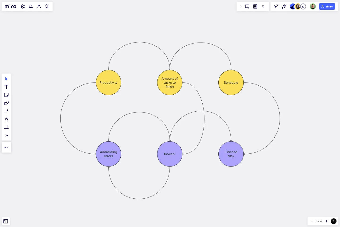
What's a causal loop diagram template?
A causal loop diagram (CLD) template is a tool that showcases the system's feedback loops and cause-and-effect relationships. Instead of viewing issues in isolation, this diagram gives a holistic view of the interactions between various system components. The template provides a structured framework, enabling teams to chart out these interconnections in an organized and easy-to-understand manner.
How to use the causal loop diagram template in Miro
Miro has intuitive features, making the creation of a CLD seamless:
Shapes library: Select the feature in the toolbar. Here, you can choose different shapes representing many elements within your system.
Arrows and connections: Use arrows to depict the direction of influence between elements. Positive and negative feedback loops can be indicated using '+' and '-' signs.
Customization: Change colors, sizes, and labels to differentiate and categorize the elements as needed.
Drag and drop: Simply drag your chosen elements onto the Miro board and position them to create your causal loop diagram.
Why should you use a causal loop diagram template?
Holistic viewpoint: The template helps understand the bigger picture by visualizing a system's complex web of relationships.
Effective problem-solving: By recognizing the underlying patterns and structures, teams can address root causes instead of superficial symptoms.
Enhanced communication: A well-structured CLD fosters clarity in discussions, promoting shared understanding amongst team members.
Strategic planning: The template helps identify use points, helping in effective decision-making and strategic interventions.
Do you need more advanced diagramming capabilities? Check Miro's diagram maker features.
What is the difference between a positive and a negative feedback loop?
A positive feedback loop amplifies changes, driving the system further from its original state. A negative feedback loop stabilizes the system, pushing it back towards a desired equilibrium.
Can I collaborate in real time with my team on the CLD?
Yes, Miro's workspace supports real-time collaboration, allowing team members to edit, comment, and discuss the diagram.
How can I share my causal loop diagram with stakeholders?
Miro offers easy sharing options. You can invite stakeholders to view or edit the board directly or export the diagram as an image or PDF to share externally.
Is there a limit to the complexity of the system I can map?
While Miro offers a vast canvas, ensuring your CLD remains readable and understandable is essential. If a system is exceedingly complex, consider breaking it down into smaller sub-systems for clarity.
Get started with this template right now.
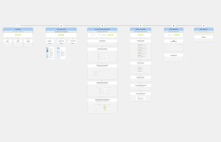
Job Search Process Diagram
Works best for:
Diagramming
The Job Search Process Diagram template offers a visual tool for mapping out the steps and stages involved in the job search process. It provides a structured framework for organizing tasks, tracking progress, and managing resources. This template enables job seekers to streamline their job search efforts, stay organized, and increase their chances of success. By promoting clarity and efficiency, the Job Search Process Diagram empowers individuals to navigate the job market effectively and achieve their career goals.
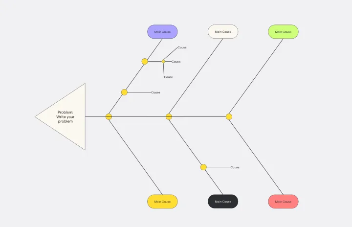
Cause and Effect Diagram Template
Works best for:
Diagramming
The Cause and Effect Diagram Template is a useful tool for analyzing complex relationships, identifying root causes of problems, and improving organizational processes. It can be customized to fit user's unique needs and provides a structured framework for analysis. Teams can use real-time collaborative analysis on the Miro platform to drive continuous improvement initiatives.
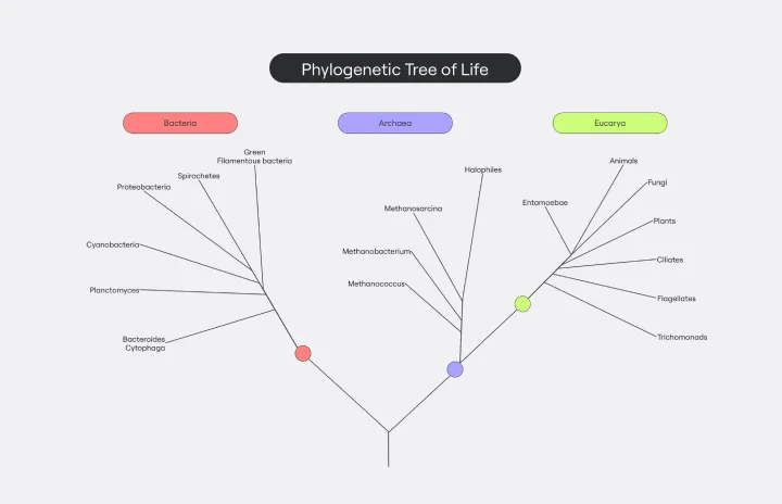
Phylogenetic Tree Template
Works best for:
Diagramming
The Phylogenetic Tree Template is a powerful tool that allows scientists and researchers to visualize evolutionary relationships between species. It is a visual representation of the history of the evolution of life on Earth and helps users identify the relationships between other organisms and their ancestors. The key benefit of this template is that it organizes complex data and makes it more understandable to everyone. Additionally, it offers an efficient way to collect and analyze data, saving time and effort and enabling users to identify significant patterns and relationships in the data.
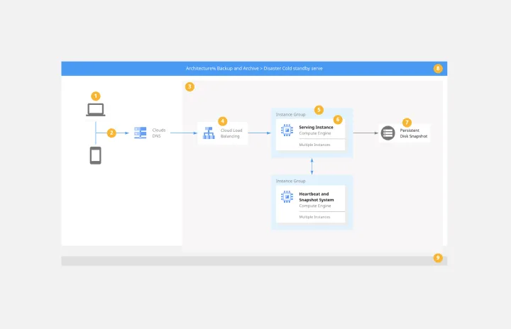
Google Cloud Architecture Diagram Template
Works best for:
Software Development, Diagrams
Use the Google Cloud Architecture Diagram template to clearly visualize the deployment of your application and allow you and your team to optimize processes. The GCP template gives you a great overview of your application architecture, and it helps you to iterate quickly and better manage your application development, deployment, and documentation. Try it out and see if it works for you.
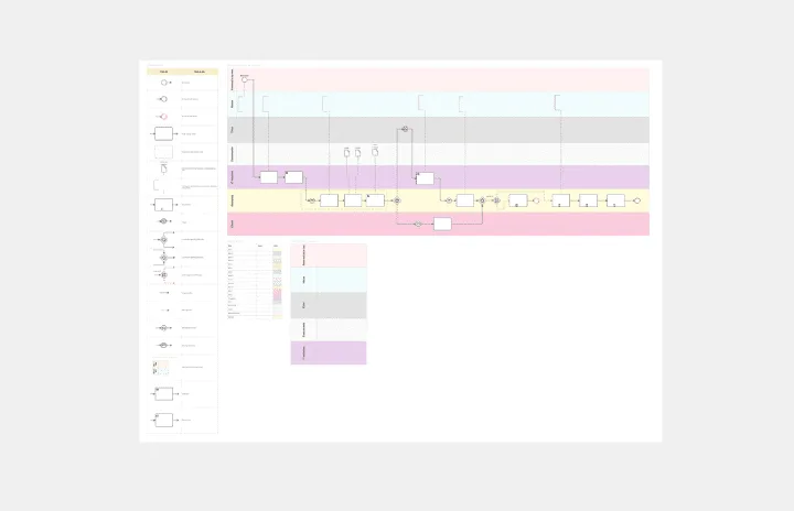
BPMN Template by Pavel Kuksa
Works best for:
Diagramming
The BPMN Template, elements, and example template offers a comprehensive visual notation for modeling business processes using the Business Process Model and Notation (BPMN) standard. It provides elements for defining process flows, activities, and decision points. This template enables teams to document and analyze business processes systematically, facilitating process optimization and automation. By promoting standardization and clarity in process modeling, the BPMN template empowers organizations to improve efficiency, agility, and compliance in their operations.
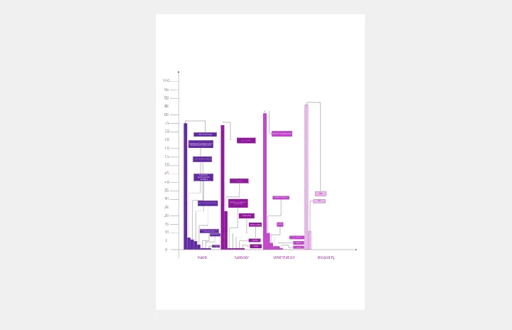
Bar Chart / Diagram Combined
Works best for:
Diagramming
The Bar Chart / Diagram Combined template offers a versatile tool for creating visualizations that combine bar charts with other diagrammatic elements. It provides elements for representing data trends, relationships, and comparisons effectively. This template enables teams to create customized visualizations that communicate complex information in a clear and compelling manner. By promoting visual clarity and insight, the Bar Chart / Diagram Combined template empowers teams to make data-driven decisions and communicate findings with impact.