User Flow Template
Help UX and product teams improve user experience with the User Flow Diagram. Create conditions for creative solutions with Miro's User Flow template.
Trusted by 65M+ users and leading companies


About the User Flow Template
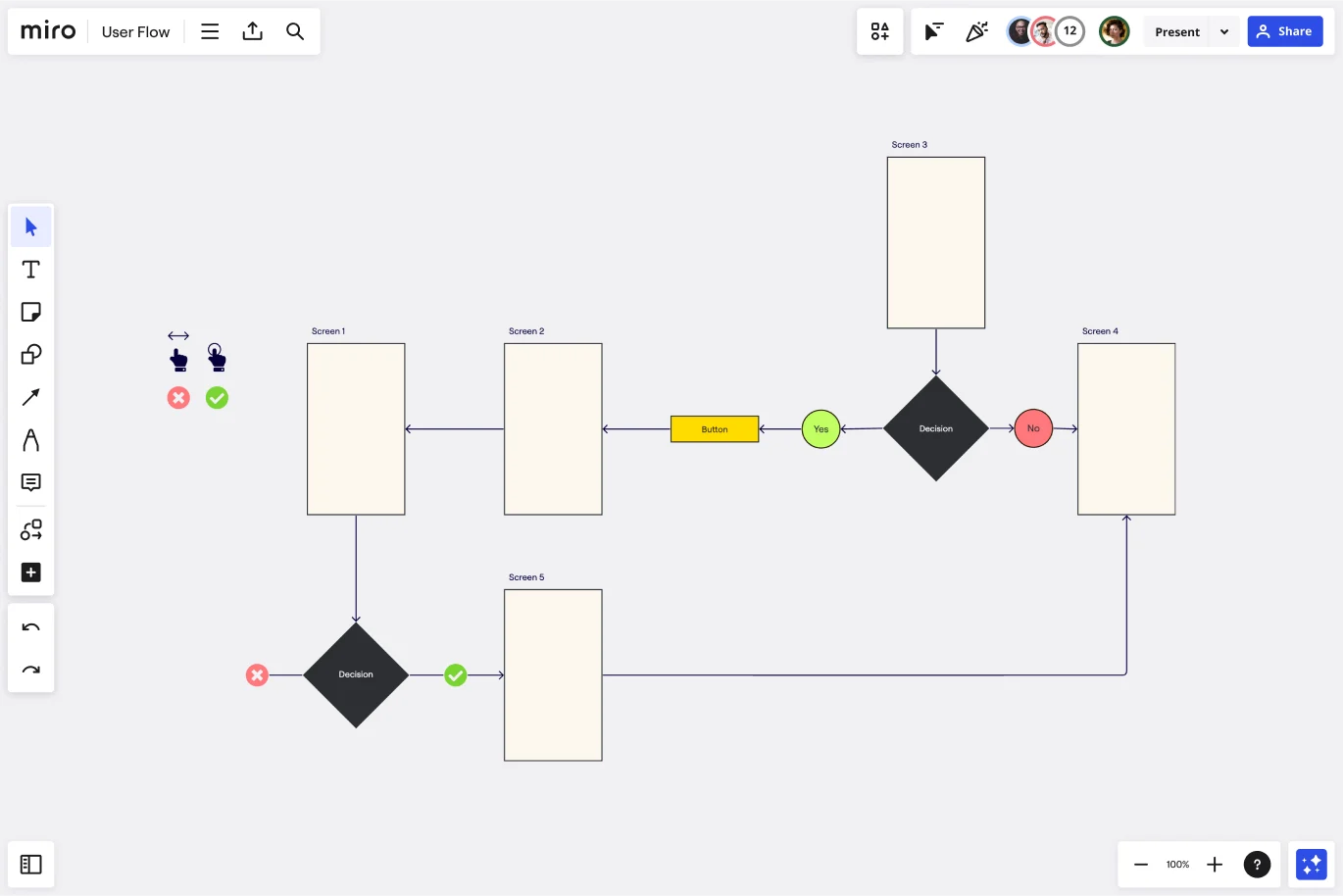
A user flow diagram (also known as an interaction or task flow diagram) is a step-by-step visual mapping process, outlining what a user does to finish a task or complete a goal through your product or experience.
Diagramming the user flow can help interpret the quality or experience of the path a user chooses. The flow can also reveal how many steps they chose to complete a task and what pathways they decide to take when interacting with your product or service to solve a pain point.
While user flow diagrams focus on how a user moves through a particular product, a Screen Flow Template presents a wireframe-style page layout in the form of a flowchart.
What is a user flow diagram?
User flows diagram help UX and product teams map out the logical path a user should take when interacting with a system. As a visual tool, the user flow diagram shows the relationship between a website or app’s functionality, potential actions a user could take, and the outcome of what the user decides to do.
The main elements of a user flow are:
A start or endpoint: this makes clear where the flow begins or finishes
Process or action: shows what steps the user takes, such as “login” or “purchase”
Decision points: shows when a user has to make a choice
Arrows: they show where the user is headed based on decisions made
Try a user flow if your team is trying to gauge or improve how the existing user experience can lead to better customer conversion rates.
The process can help you keep your user in mind and pinpoint the business objective, such as a purchase, newsletter sign-up, or opting for a free trial.
When to use a user flow template
User flow diagrams can help you:
Build intuitive interfaces: does your flow feel easy to move through, efficient to use, and intuitive to the user?
Decide if your existing interface is fit-for-purpose: what’s working, not working, or needs improvement? Does the flow feel seamless and make sense?
Present your product flow to internal teams or clients: can your design team see what your customer says or does during the purchase, sign-up, or log-in process? Can clients get a step-by-step overview to align with your vision?
When creating – or recreating – a user flow, ask yourself and your team:
What’s the user trying to do?
What’s important to the user and will give them the confidence to keep going?
What extra information will the user need to be successful?
What are the user’s hesitations or barriers to accomplishing the task?
A user flow map can help designers (and their teams or clients) stay user-centered, even when mapping out complex processes.
As a designer, you can use user flow diagrams to decide how you’ll design pages, screens, or surfaces on your website or app and rearrange what content and navigational tasks to include.
Create your own user flow diagram
Mapping your own user flow is easy. Miro’s visual workspace is the perfect canvas to create and share your diagram. Start by selecting the user flow template, then take the following steps to make one of your own:
Decide on your business objectives and your users’ objectives.
Figure out where you’d like your users to end up. If you don’t have one already (or need to update it), use a customer journey map to create a shared vision of your customer experience. Every team member can benefit from a shared understanding of your customers’ feelings at every potential touchpoint with your product or service. Building user empathy will inform every step of your user flow process.
Discover how visitors find your website.
Are they finding your product or service through direct traffic, organic search, paid advertising, social media, referral links, or emails? These points will be the start of your user flow diagram, depending on what you find out.
Find out what information your users need and when they need it.
Users convert when they’re served the right information at the right time, so consider what your customer wants from your digital touchpoint and how they may be feeling. Engagement – for example, a chatbot interaction – is still a potential success metric – it’s not all about leading to a final purchase.
Map out your user flow.
You can edit the existing shapes and arrows from our user flow template to accommodate the user research you’ve uncovered in the previous steps. After your customer discovers your first touchpoint, what do they do next? How many steps until they complete a task? Use the basic user flow on the template to start drawing your own. Change touchpoints and drop-offs and connector lines arrows directions to fit your user flow diagram better.
Get feedback from your team.
Invite your team, clients, or cross-functional stakeholders to view your Miro Board. You can choose to leave feedback asynchronously with sticky notes or @mentions for peer review. You can also hop on a video call in your Miro Board and assign someone on your team to play a note-taker role. Once you have enough team input, make adjustments accordingly.
Share with other stakeholders or clients and keep reiterating as needed.
Your user flow will change over time as your customers’ attitudes and motivations evolve. Adapt accordingly, stay user-centered.
What is a user flow example?
Imagine you are developing a site for an event. If you want to improve your user experience, you must map out all the necessary steps to the event’s registration and purchase of tickets. You can start by tracking your customer flow and where they begin their journey to buy your event’s tickets. The user flow diagram helps you visualize at a glance how the customer will complete their purchase (your website’s ultimate goal), from registration to payment page.
Get started with this template right now.
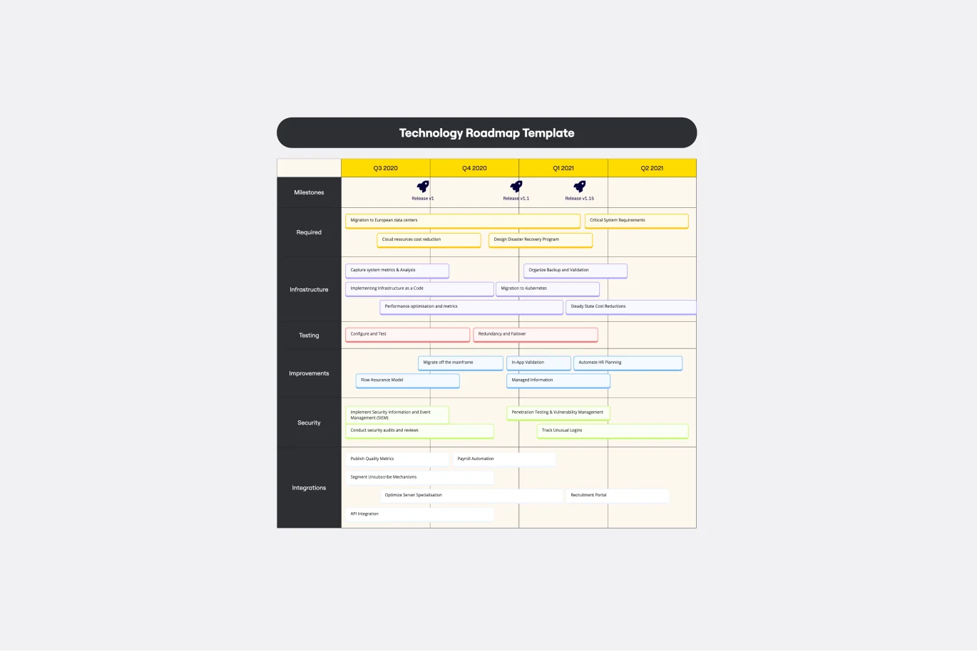
Technology Roadmap Template
Works best for:
Agile Methodology, Roadmaps, Agile Workflows
A technology roadmap helps teams document the rationale of when, why, how, and what tech-related solutions can help the company move forward. Also known as IT roadmaps, technology roadmaps show teams what technology is available to them, focusing on to-be-scheduled improvements. They allow you to identify gaps or overlap between phased-out tech tools, as well as software or programs soon to be installed. From a practical point of view, the roadmap should also outline what kinds of tools are best to spend money on, and the most effective way to introduce new systems and processes.
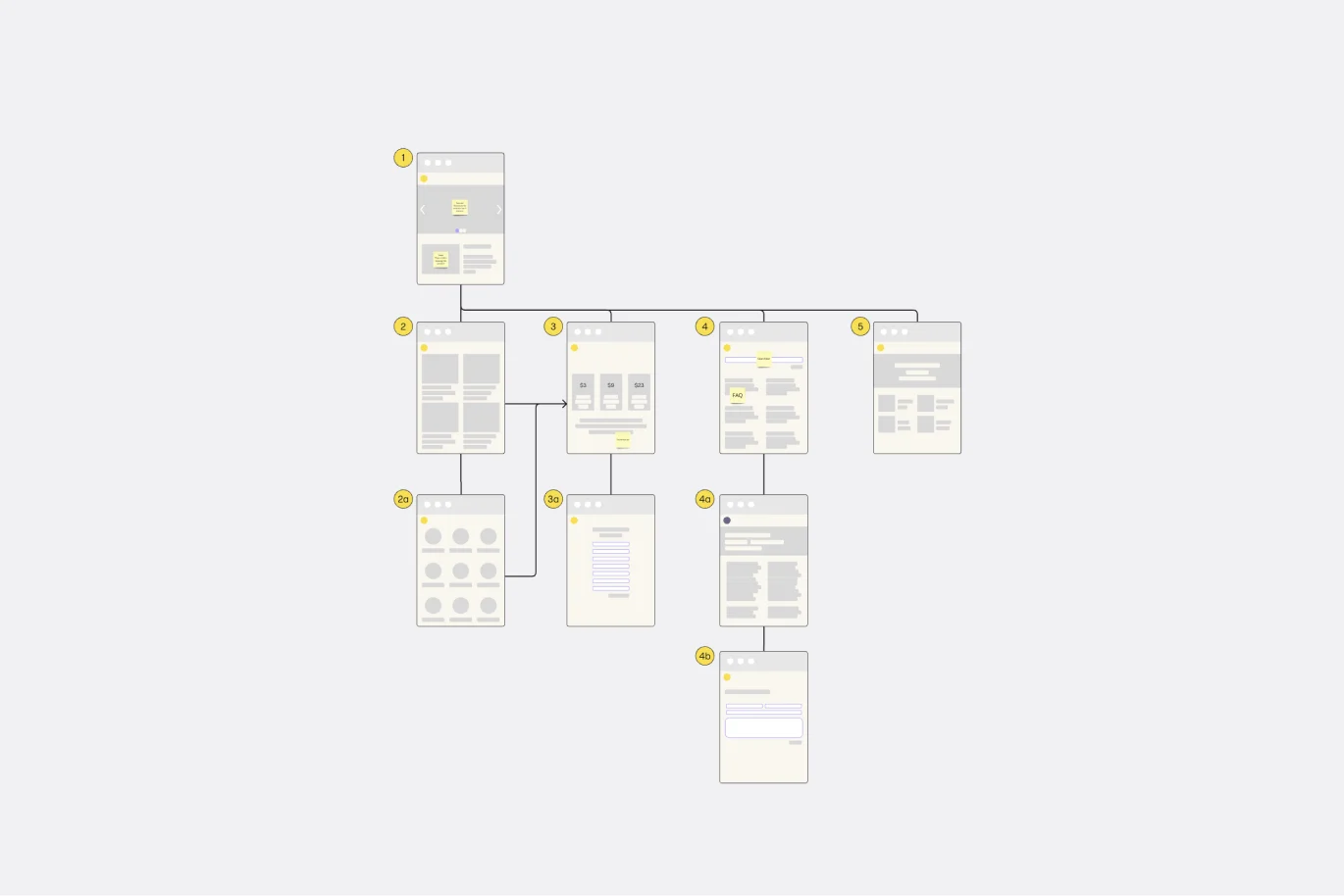
Website Flowchart Template
Works best for:
Flowcharts, Mapping, User Experience
A website flowchart, also known as a sitemap, maps out the structure and complexity of any current or future website. The flowchart can also help your team identify knowledge gaps for future content. When you’re building a website, you want to ensure that each piece of content gives users accurate research results based on keywords associated with your web content. Product, UX, and content teams can use flowcharts or sitemaps to understand everything contained in a website, and plan to add or restructure content to improve a website’s user experience.
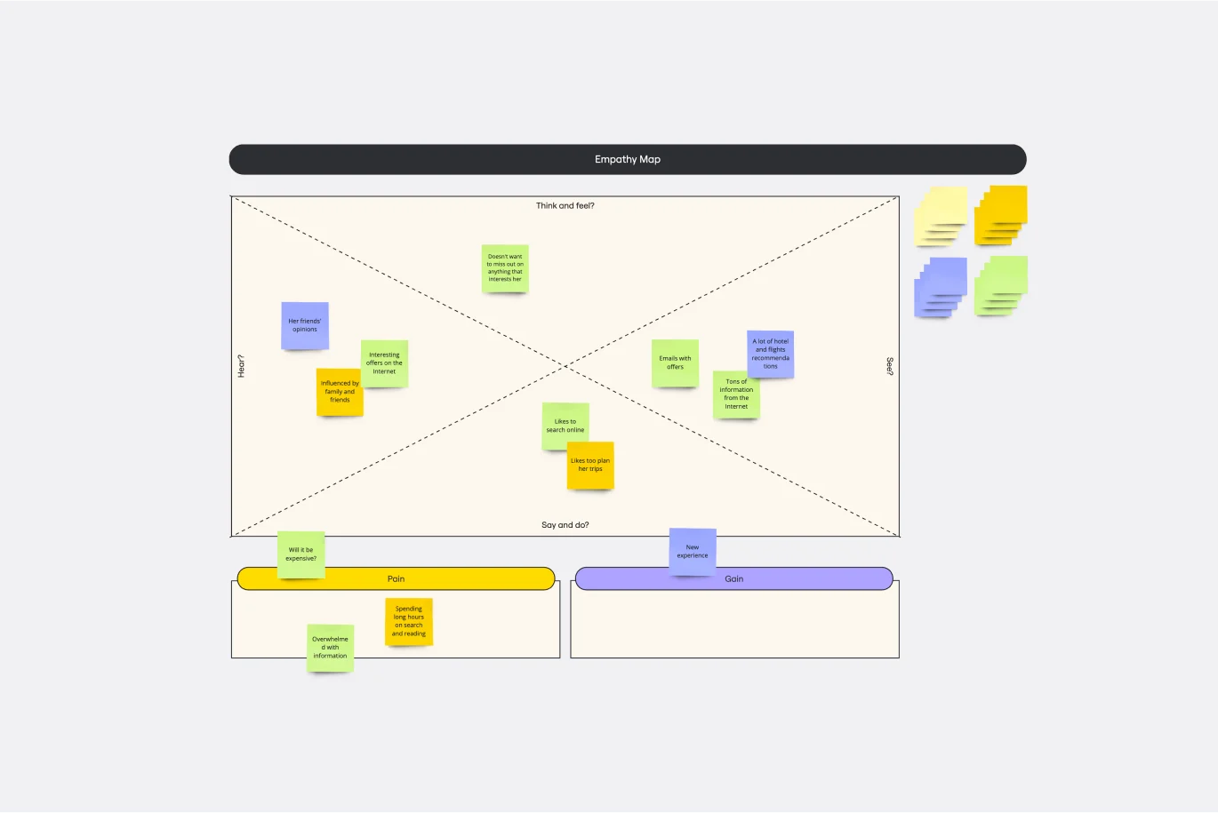
Empathy Map Template
Works best for:
Market Research, User Experience, Mapping
Attracting new users, compelling them to try your product, and turning them into loyal customers—it all starts with understanding them. An empathy map is a tool that leads to that understanding, by giving you space to articulate everything you know about your customers, including their needs, expectations, and decision-making drivers. That way you’ll be able to challenge your assumptions and identify the gaps in your knowledge. Our template lets you easily create an empathy map divided into four key squares—what your customers Say, Think, Do, and Feel.
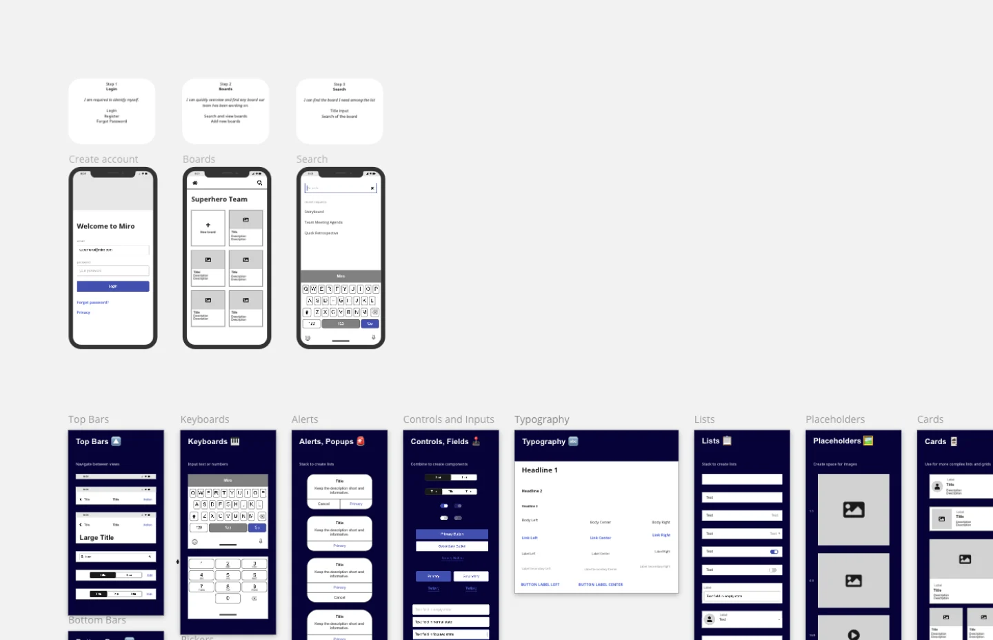
App Wireframe Template
Works best for:
UX Design, Wireframes
Ready to start building an app? Don’t just imagine how it will function and how users will interact with it—let a wireframe show you. Wireframing is a technique for creating a basic layout of each screen. When you wireframe, ideally early in the process, you’ll gain an understanding of what each screen will accomplish and get buy-in from important stakeholders—all before adding the design and content, which will save you time and money. And by thinking of things in terms of a user’s journey, you’ll deliver a more compelling, successful experience.
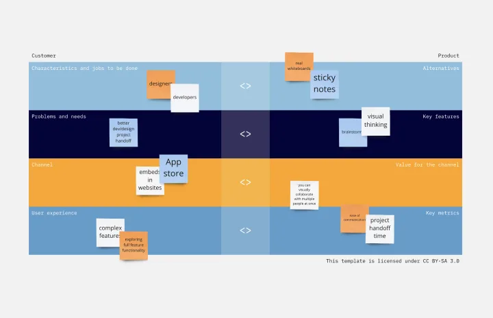
Product / Market Fit Canvas Template
Works best for:
Market Research, Strategic Planning, Product Management
The product/market fit canvas template is used to help product teams meet customer and market needs with their product design. This template looks at a product in two dimensions: first, how the product fits user needs, and second, how the fully designed product fits within the market landscape. This combined metric understands a product holistically from the way customers use and desire a product, to the market demand. By comparing customer and product qualities side by side, users should better understand their product space and key metrics.
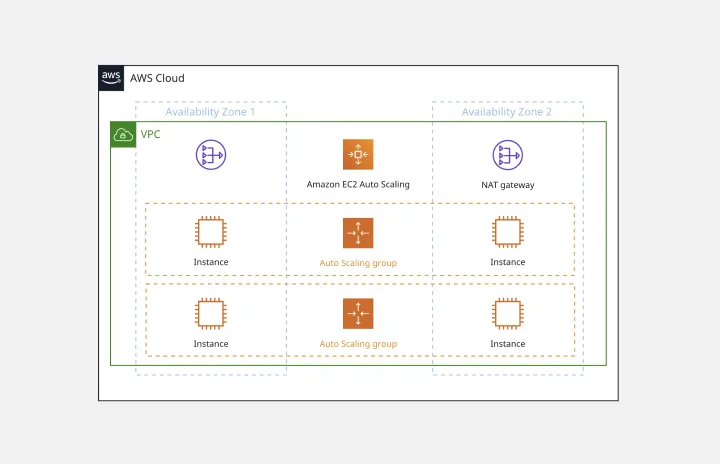
AWS Architecture Diagram Template
Works best for:
Software Development, Diagrams
The AWS Architecture Diagram is a visual representation of the AWS framework, and it also translates the best practices when using Amazon Web Services architecture. You can now have an overview of your AWS architecture with Miro’s AWS Architecture Diagram Template, track your cloud solutions easily, and optimize processes like never before.