Pie Chart Template
Present relationships between datasets and see contrast right away with the pie chart template.
Trusted by 65M+ users and leading companies


About the Pie Chart Template
A pie chart template shows the relationships between datasets, illustrated within a circle. It’s often also referred to as a circle chart. The circle sections look like slices of a pie and represent different datasets so that you can easily compare them all at once. The Pie Chart Template is an excellent tool to enhance presentations and make data more digestible to any audience.
What is the pie chart template
The pie chart template is a circle with sections, representing the pie ‘slices’, with the arc’s length being proportional to the quantity represented. The sections making up the pie chart, often displayed in percentages, are equal to 100% when added up, making a full circle.
When to use the pie chart template
Professionals across many industries use pie charts to compare data and show contrasts. It’s one of the most used diagrams since it can be easily read and interpreted.
Business organizations and the educational sector use pie charts and other graphs to support storytelling with visual data, and engage audiences easily and more quickly.
How to create a pie chart
You can easily make a pie chart in Miro, either using our ready-made template or drawing one from scratch. Miro’s extensive diagramming capabilities make it the perfect pie chart maker, where you can, with just a few clicks, create your own pie chart.
How to make a pie chart using our ready-made template:
Select the pie chart template.
Double-click the pie chart to add data to each series. Make sure to add real numbers and not percentages.
Edit title and legend.
After you set your pie chart, you can edit how it looks and change the colors as you like.
How to create a custom pie chart:
Click ‘charts’ on the toolbar.
Select the object, in this case, the pie chart.
Double click the pie chart. A pop-up window will show.
Add your data.
In Miro, you can edit the values of your pie chart, and the colors will be selected automatically.
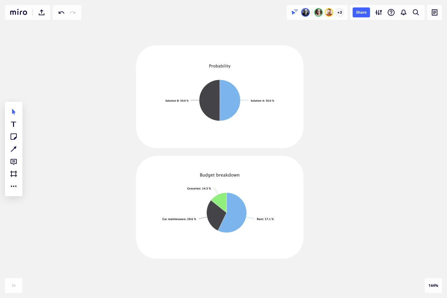
A pie chart example
Let’s say you want to save on your water consumption. To analyze how much water you are using, you can create a pie chart to show all the ways you consume water and how much water each of them uses. You can add toilet consumption, shower, kitchen sink, washing machine, dishwasher, and any leakages. For each of these, add the percentage of their consumption.
As you can see, the total consumption should be 100%, which will configure your whole pie chart.
With this pie chart, you can see right away which one has the most significant share of consumption and which one has the lowest.
Where can I create a pie chart?
People often create a pie chart to visually show data when doing presentations or delivering reports. Miro is an excellent pie chart maker, where you can easily create your pie chart and attach it to any other document by either downloading or embedding your pie chart template board. Highly customizable, our pie chart template is also easily shareable so you and your team can add ideas and make communication flow easier with it. Try it for yourself and see if that works for you.
Get started with this template right now.
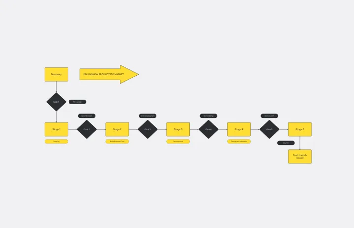
Stage-Gate Process Flowchart Template
Works best for:
Diagramming, Project Management
The Stage-Gate Process Flowchart Template structures a project into distinct stages separated by decision-making gates, enhancing the quality of decisions and leading to more successful project outcomes.
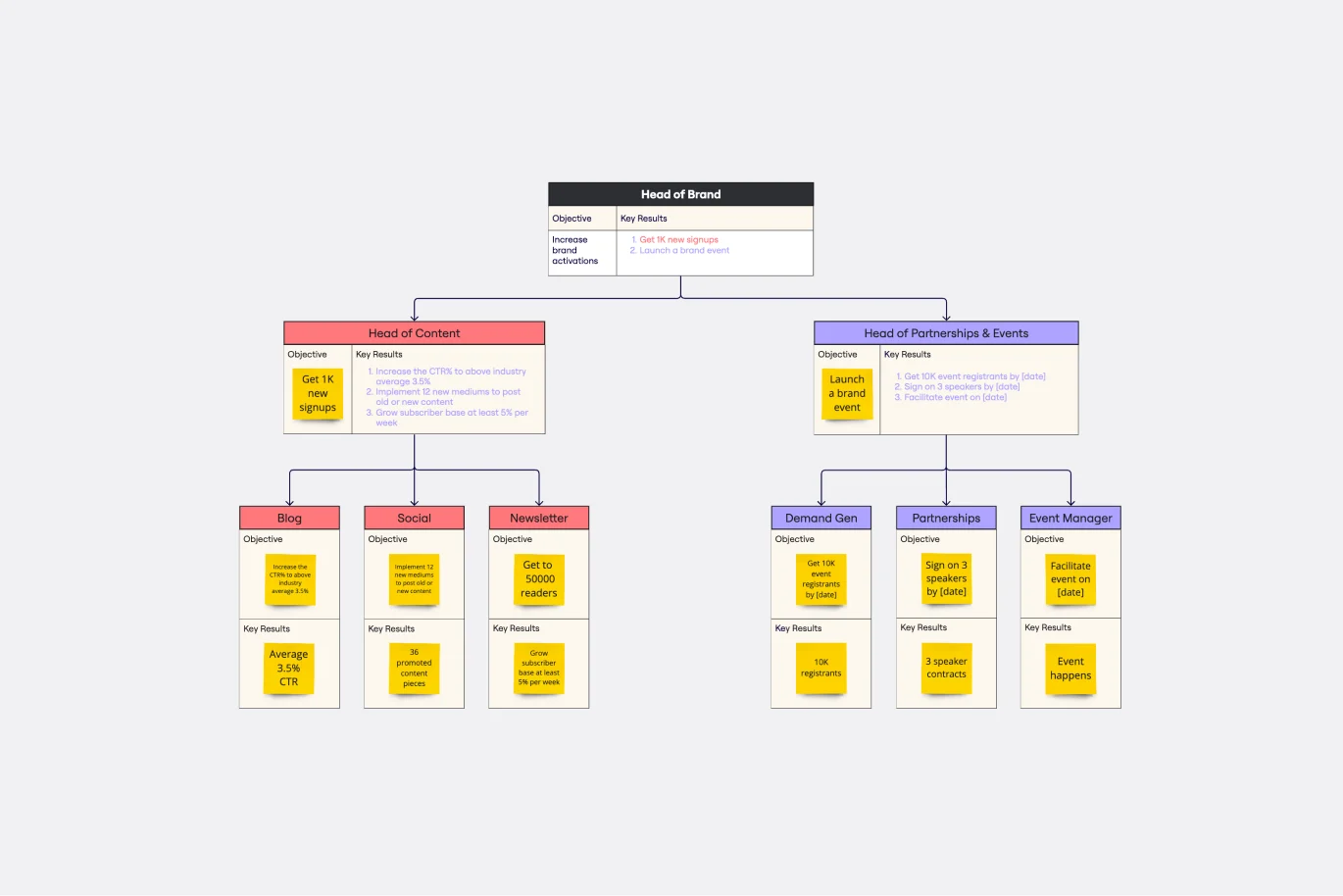
Objectives and Key Results (OKRs) Template
Works best for:
Leadership, Strategic Planning, Project Planning
Clarity, focus, and structure — those are the key ingredients to feeling confident in your company’s directions and decisions, and an OKR framework is designed to give them to you. Working on two main levels — strategic and operational — OKRs (short for objectives and key results) help an organization’s leaders determine the strategic objectives and define quarterly key results, which are then connected to initiatives. That’s how OKRs empower teams to focus on solving the most pressing organizational problems they face.
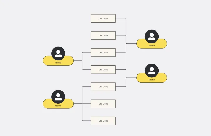
Use Case Diagram Template
Works best for:
Marketing, Market Research, Diagrams
A use case diagram is a visual tool that helps you analyze the relationships between personas and use cases. Use case diagrams typically depict the expected behavior of the system: what will happen and when. A use case diagram is helpful because it allows you to design a system from the perspective of the end user. It’s a valuable tool for communicating your desired system behavior in the language of the user, by specifying all externally visible system behavior.
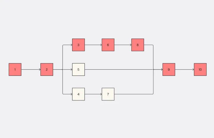
Critical Path Method Template
Works best for:
Diagramming, Project Management
Elevate your project management game with the Critical Path Method Template—an indispensable tool that brings clarity and precision to your project timelines. The template instantaneously adjusts as you edit tasks and dependencies, ensuring that your critical path is consistently up-to-date. This capability not only simplifies the complex process of project scheduling but also empowers your team to proactively respond to evolving project dynamics, fostering adaptability and efficiency throughout the project lifecycle.

Value Stream Mapping Template
Works best for:
Project Management, Strategic Planning, Mapping
A value stream map can help you refocus your business on steps that actually provide value to your customers, cutting out wasteful and inefficient processes. With this template, you and your process team can collaborate on a value stream map today.
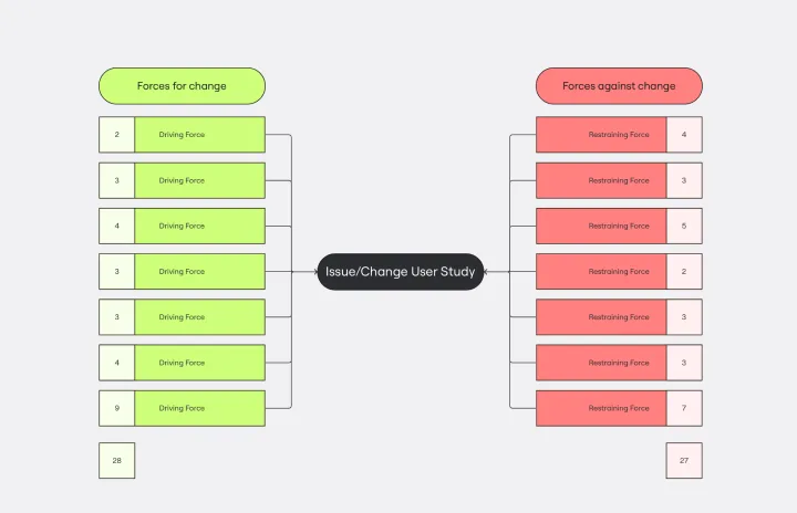
Force Field Analysis Template
Works best for:
Diagramming, Strategic Planning
A Force Field Analysis Template is a powerful tool that helps teams identify and analyze the forces supporting or hindering progress toward a specific change or goal. This template provides a visual space where you can brainstorm and plot out 'driving forces' that push objectives forward and 'restraining forces' that prevent advancement, all on a single, intuitive board. One of the primary benefits of utilizing the Force Field Analysis template is that it fosters a shared understanding among team members. By visually mapping out and discussing each force, teams can prioritize efforts, build consensus on the central issues to tackle, and collaboratively devise strategic plans to strengthen positive influences while reducing negative ones.