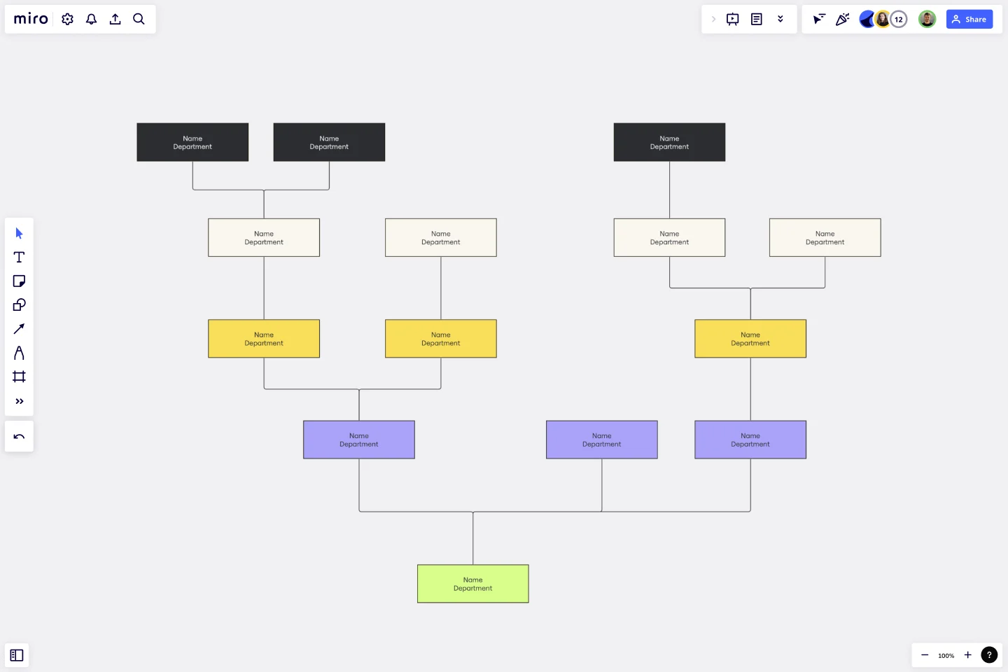
Inverted Org Chart Template
Bring an innovative approach to organizational design with the inverted org chart template. Reimagine the traditional hierarchies and place the frontline employees at the top of your organizational structure.
Trusted by 65M+ users and leading companies


About the Inverted Org Chart Template
The structure of organizations is constantly changing. The traditional hierarchical arrangement where executives are at the top and frontline employees at the bottom is no longer the norm. Instead, we have the Inverted Org Chart Template.
This new and innovative tool prioritizes frontline employees in visualizing organizational structure. This template flips the traditional pyramid, giving prominence to those closest to the customers, products, or services. The layout includes areas for frontline employees, mid-level management, senior leadership, and executive roles, among others. Miro's org chart maker is designed to be intuitive, allowing stakeholders to quickly understand the structure and identify where each role fits within the inverted hierarchy.
How to use the inverted org chart template
Edit with ease: By double-clicking shapes, adjust the template to your liking. Whether renaming positions, adding new roles, or reshuffling the structure, the template is designed for simplicity and efficiency.
Expand as needed: The automated diagramming features make it a breeze to expand the template. Add more shapes for new roles or departments, and connector lines automatically adjust to maintain a coherent visual.
Add contextual artifacts: Enhance the chart's clarity and relevance by adding any artifact—be it notes, images, links, or documents. The template seamlessly integrates with other tools, allowing you to provide richer context and deeper insights.
Why should you use an inverted org chart template?
Employee-centric Vision: The chart places frontline employees at the top, emphasizing the importance of those who directly interact with customers and creating a culture of appreciation and recognition.
Improved transparency: This layout provides a clear view of the company's structure, making it easier for everyone to understand the chain of command and reporting relationships.
Encourages feedback loop: With frontline employees in a prominent position, it promotes a feedback-driven environment where insights from the ground can quickly ascend the hierarchy, fostering communication and collaboration.
Adaptable to change: The template's design is flexible, allowing for swift modifications as the organization evolves, grows, or restructures.
Enhances communication: By visualizing the flow of communication in an inverted manner, teams can better understand how information should flow and ensure effective cross-departmental collaboration.
Is the inverted org chart suitable for all industries?
Yes, the Inverted Org Chart is adaptable and can be tailored to suit any industry, emphasizing the roles and responsibilities most crucial to that particular sector.
How many levels can I add to the chart?
The template is designed for scalability. You can add as many levels as necessary to represent your organization's structure accurately.
Can I integrate other tools with this template?
Absolutely! The template is designed to seamlessly integrate with other tools, allowing you to add notes, images, links, or documents for richer context.
What if my organization follows a traditional hierarchy?
While the Inverted Org Chart prioritizes frontline employees, it can be easily adapted to represent traditional hierarchies. The key is to use its features to depict your organizational structure best.
Get started with this template right now.
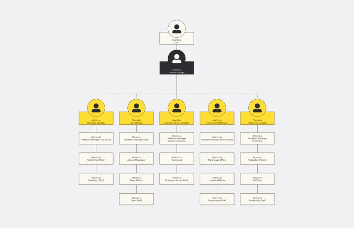
Dotted Line Org Chart Template
Works best for:
Org Charts
The Dotted Line Org Chart Template promotes transparency by demonstrating a dynamic representation of dotted line reporting relationships. This feature allows users to display both direct and indirect connections within an organization in a visual format, which offers a better understanding of how roles intersect and work together. By incorporating dotted lines seamlessly into the chart, this template goes beyond traditional hierarchical structures to ensure that complexities in reporting are fully communicated.
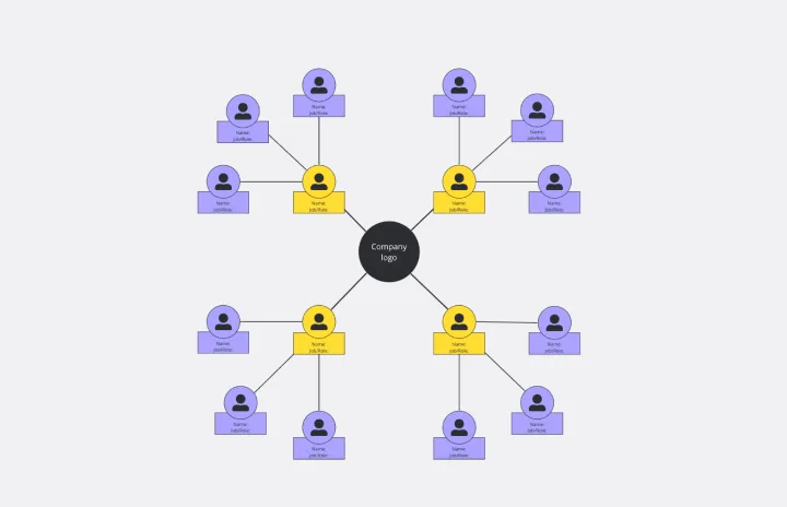
Circular Org Chart Template
Works best for:
Organizational Chart
The Circular Org Chart Template is an innovative solution that helps represent and visualize complex organizational structures with ease. The key advantage of this template is its ability to present complex hierarchies in a visually appealing and easy-to-understand format. By adopting a circular arrangement, the template provides a comprehensive and holistic view of the organization, making it effortless for teams to comprehend reporting relationships at a glance. The visual clarity offered by this template fosters efficient communication and decision-making, offering a seamless experience for teams to understand their organizational structure. The template's intuitive design and emphasis on visual representation significantly enhance transparency, promoting a deeper understanding of organizational roles and relationships.
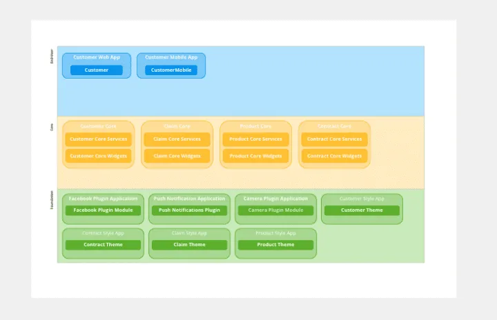
OutSystems Architecture Diagram
Works best for:
Diagramming
The OutSystems Architecture Diagram template offers a visual tool for designing and documenting software architectures using the OutSystems platform. It provides elements for modeling application components, data structures, and integration points. This template enables teams to visualize and communicate the architecture of their OutSystems applications, facilitating collaboration and alignment among developers and stakeholders. By promoting clarity and understanding of system architecture, the OutSystems Architecture Diagram empowers teams to build scalable, maintainable, and high-performance applications effectively.
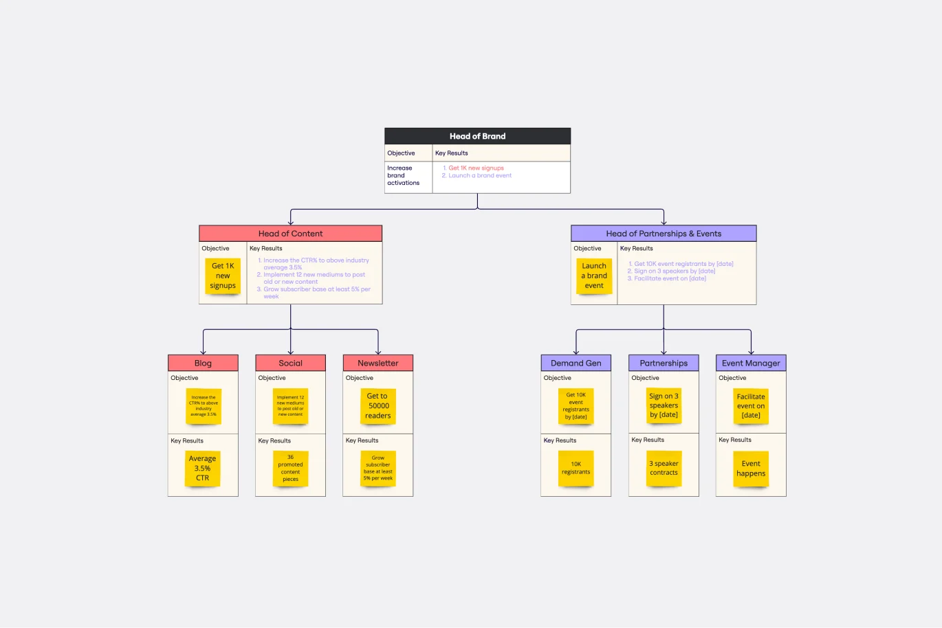
Objectives and Key Results (OKRs) Template
Works best for:
Leadership, Strategic Planning, Project Planning
Clarity, focus, and structure — those are the key ingredients to feeling confident in your company’s directions and decisions, and an OKR framework is designed to give them to you. Working on two main levels — strategic and operational — OKRs (short for objectives and key results) help an organization’s leaders determine the strategic objectives and define quarterly key results, which are then connected to initiatives. That’s how OKRs empower teams to focus on solving the most pressing organizational problems they face.

Value Stream Mapping Template
Works best for:
Project Management, Strategic Planning, Mapping
A value stream map can help you refocus your business on steps that actually provide value to your customers, cutting out wasteful and inefficient processes. With this template, you and your process team can collaborate on a value stream map today.
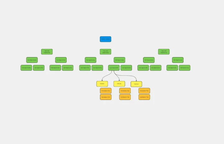
Opportunity Solution Tree
Works best for:
Diagramming
The Opportunity Solution Tree template is a visual tool for identifying and prioritizing opportunities and solutions. It provides a structured framework for mapping customer needs, pain points, and potential solutions. This template enables teams to explore divergent ideas, evaluate alternatives, and focus on high-impact solutions. By promoting customer-centricity and innovation, the Opportunity Solution Tree empowers teams to address market needs effectively and deliver value-driven solutions.